I used a photograph which I took of my group which is displayed on the bottom right of the poster to link it back to my digipak. This photograph relates to my light and dark choice of colour for my digipak and poster. I have posts which display my exemplification of my construction and development of my digipak and poster.
Friday, 19 December 2014
Final Poster Design
I used a photograph which I took of my group which is displayed on the bottom right of the poster to link it back to my digipak. This photograph relates to my light and dark choice of colour for my digipak and poster. I have posts which display my exemplification of my construction and development of my digipak and poster.
Thursday, 18 December 2014
Poster Production Process

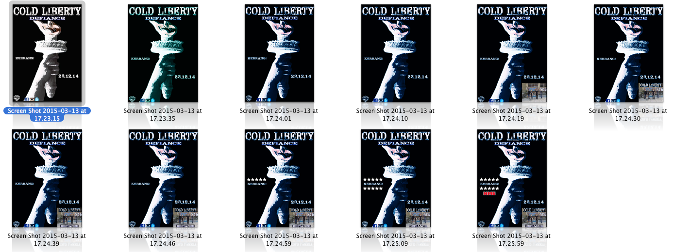
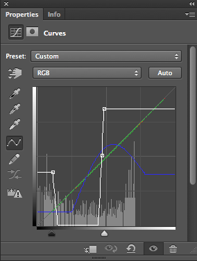
During the production of my poster I took printscreens of every change I incorporated to my poster. I began by inverting my poster to black and white making it easier to incorporate colour alteration. I used the curve and gradient tool to create and form my colours scheme for my poster, the same colour scheme mainly applies to my digipak as well.


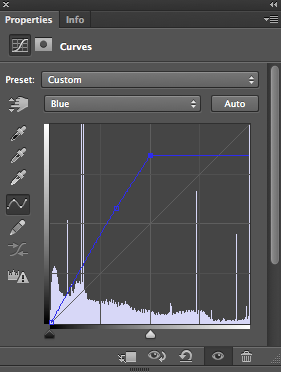
I used the curve effect to alter the colour for my poster; I also did this for my digipak. I managed to form multiple layers to create patterns of different colours; after creating laters of different shades and colours I manifested them together to create my final colour scheme. Each layer has different attributes: colour, brightness, opacity, contrast, patterns and other features.
Digipak Production Process

During the production of my digipak I took screenshots to show how I developed and made changes to my ancillary text. Throughout the screenshots; you can see how the colour scheme is consistant throughout the digipak. However, I tried to keep some light colours in my digipak to make it more relevant to my logo and fonts; these two ideologies create an icy effect which relates to my band name, I also used the gradient tool to form the same aspect to my track listing, a white divide appears in the middle and the ends display a light blue. I have used the same colour scheme for my poster and other conceptions which are displayed within my ancillary texts. Like my poster, I used the logo which I created on Photoshop as my main image. After researching other digipaks, posters and album covers I noticed that bands within the same genre as my own used their logo instead of photographs of the band. I decided to follow this convention and implement it to my own ancillary texts by using my logo artwork for the digipak and poster main image.
Final Digipak Design
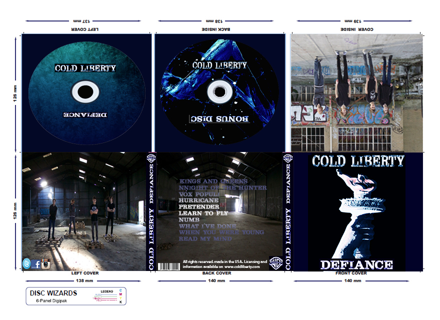
This is the final design of my digipak; I used a variety of tools on Photoshop to manipulate the images which I captured by using my camera of myself and my group and the images which I designed and altered by using filters and custom effects. I initially aimed towards a dark colour scheme to bring relevance to the conventions of my genre (alternative rock). I used the gradient tool (Photoshop) to form diverse customisations - I mainly focused on dark blue conceptions. I also used the curve tool for the majority of my colouration manipulation. I managed to alter the brightness and contrast to form my colour scheme, in addition, I only gave minor alterations to my photographs, I wanted to keep them more naturalistic in relation to their exposure. By combining light and dark colours, I thought this would make my colour scheme and my digipak my unique and appealing. I used the gradient tool on the track list which is displayed on the back cover. I managed to stretch the colour I wanted vertically and I used a mirror effect to divide the colour.
For my disc design, I manipulated two similar images. For my primary disc I use an image of frost against a transparent surface, I managed to alter the image by removing/cropping the majority of the image until I was left with a fraction of the desired sector; I used the curve and gradient tool to incorporate my own colour customisation and the curve tool to manipulate the image further with colour patterns, colour removal and contrast. I wanted this image to essentially be lighter to correspond with my photographs to balance out the light and dark perception for my colour scheme
For my second disc (bonus disc) I used an ice cube, I practically used the same method for my first but I went for a darker approach to link to my front cover (main image) I removed the entire background until I was left with small light sectors. I highlighted and enhanced the corners and edges of the image to raise my initial effect (blue lines) by removing the majority of the image and forming an abstract image.
I designed a font which would relate to both key aspects of my colour scheme (light and dark) I used the curve tool to highlight parts of the font where I wanted to incorporate colour and areas where I wanted to remain untouched. I used a used a dark blue (same colour for my main image, backgrounds and poster). The colour appeared on the outer region of the text, this brought an icy effect on my font. This related to my band name (Cold Liberty) I wanted an icy effect fir my fonts. 'Cold Liberty' is our initial band name and 'Defiance' is the album name I came up with for my album.
For my main image (front cover) and poster, I used the curve and gradient tool to create the same colour customisation which I used to form my colour conventions. I found an image in the internet (Statue of Liberty's torch) I discarded the entire image until I was left with the torch; I experimented with various colour patterns but I used the same colour which I used for the majority of my work. I inverted the image so I was left with a plane white image, I then incorporated all of my own colour designs and effects to form the final design displayed on my front cover sector.
Instead of keeping my record label with it's original black and white colour, I incorporated my own colour customisation to make it more distinctive in relation to my whole digipak.
Poster Changes
I made minor changes to my poster to give it a more of a professional standard; the social media icons looked squashed together so I managed to change them by correcting their placements. I edited the release date for the poster by adding a stroke effect, a black highlight for the exterior, I also moved it to the lower middle of the poster because it seemed empty in the lower middle area before hand.
Disc Design Experimentation
For my digipak, I wanted to design and manipulate an image to place over my disc. To began by inverting the image from black to white.
I mainly used the curve and gradient tool to manipulate the colour of the image; I wanted to create a colour scheme which correlates with my initial digipak. I varied the brightness by experimenting with various shades and patterns. The images displayed above gradually become darker and more bold in colouring.
I tried to incorporate other colours (green, red) to my digipak for different results - just to essentially experiment with colour.
I began to use the gradient tool to convey a more horizontal effect of colour on my design; I created two horizontal; layers of colour for my design - the blue gradually becomes bolder and darker when it moves down the image, I placed a black layer in the centre to vary the colouring (to create a colour scheme).
After creating these designs for my digipak; I realised that the design does not correlate well with my initial digipak design, therefore, I will not use any of these designs for my disc design. I will experiment with another image and manipulate it for my desired disc design.
Tuesday, 16 December 2014
Background/Disc Experimentation
I created a pattern on Photoshop and I wanted to manipulate it further by adding different masks and filters. I tried to gather an inky effect with a black and white colour scheme. I experimented with other colours but I wanted to keep a consistent dark theme. I was going to use the final image as a background for one of my discs which would appear on my digipak. However, after realising that I wanted to have a dark blue colour scheme. I reconsidered and decided not to use any of these images for my disc construction. I planned to make an icy effect, background for my discs by experimenting with different masks, filters, patterns and by using various tools like the gradient and curve tool to manipulate my colour scheme across my subjects.
Monday, 15 December 2014
Music Video: Draft One
This is the first draft of our music video; we did not have a substantial amount of film work/ footage at this point. We did not have any desirable footage for our narrative for the first draft - we only had a fraction of our performance.
As a group we were able to set up a stage and the required equipment to shoot the first part of our performance sequence for our music video. We had a group discussion and scrutinised the footage which we established and discussed and elaborated on a plan for the next performance shoot and a plan for the narrative sector for our music video. As a whole; we established a whole plan for the narrative and the development of our performance sequence
Monday, 8 December 2014
Font Design
To create the colour scheme for my fonts I used the gradient and curve tool to gather an icy effect to stretch across my fonts. I initially added a dark blue background to form a greater relationship between colour. I also manipulated the record label by covering it with the pattern I created by using a variety of tools to get the satisfactory effect. I wanted to keep a consistent dark theme throughout my work. I also tried to create a connection/relationship my removing the colour from my music video and making it black and white.
Updated Pitch
This is the initial pitch presentation for our music video. Here we have all the work that we had been working on for the last month into one presentation. We decided to display the musical composition cull that we made and we put an detailed analysis about it. We inserted the audience profiling that we had engendered along with our mood board since they linked together. We withal put the story-boarding and animatic that we engendered since both of them withal link together. The location and photo-shoot shots and the final logo conception were again additionally in our presentation, this is to display the rest how far we have come so far. It additionally sanctions them to tell us what we require to integrate and what could be amended
Friday, 5 December 2014
Tuesday, 25 November 2014
Friday, 21 November 2014
Feedback for our Pitch
These are the feedback sheets we received after presenting our pitch/presentation to the class, we received quite a lot positive feedback, we will be presenting a more updated and improved pitch with more content.
Thursday, 20 November 2014
Process of Digipak Draft One
Subscribe to:
Comments (Atom)


