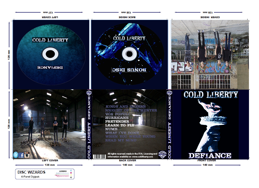
For my disc design, I manipulated two similar images. For my primary disc I use an image of frost against a transparent surface, I managed to alter the image by removing/cropping the majority of the image until I was left with a fraction of the desired sector; I used the curve and gradient tool to incorporate my own colour customisation and the curve tool to manipulate the image further with colour patterns, colour removal and contrast. I wanted this image to essentially be lighter to correspond with my photographs to balance out the light and dark perception for my colour scheme
For my second disc (bonus disc) I used an ice cube, I practically used the same method for my first but I went for a darker approach to link to my front cover (main image) I removed the entire background until I was left with small light sectors. I highlighted and enhanced the corners and edges of the image to raise my initial effect (blue lines) by removing the majority of the image and forming an abstract image.
I designed a font which would relate to both key aspects of my colour scheme (light and dark) I used the curve tool to highlight parts of the font where I wanted to incorporate colour and areas where I wanted to remain untouched. I used a used a dark blue (same colour for my main image, backgrounds and poster). The colour appeared on the outer region of the text, this brought an icy effect on my font. This related to my band name (Cold Liberty) I wanted an icy effect fir my fonts. 'Cold Liberty' is our initial band name and 'Defiance' is the album name I came up with for my album.
For my main image (front cover) and poster, I used the curve and gradient tool to create the same colour customisation which I used to form my colour conventions. I found an image in the internet (Statue of Liberty's torch) I discarded the entire image until I was left with the torch; I experimented with various colour patterns but I used the same colour which I used for the majority of my work. I inverted the image so I was left with a plane white image, I then incorporated all of my own colour designs and effects to form the final design displayed on my front cover sector.
Instead of keeping my record label with it's original black and white colour, I incorporated my own colour customisation to make it more distinctive in relation to my whole digipak.
No comments:
Post a Comment